branding photography
How I Edit Branding Photos: A Natural and Authentic Style
I'd like to share with you my approach to editing branding photos as a professional photographer in Zurich. While I love to add an artistic touch to my personal projects like travel photography or portraits, for my business photography I like to keep a more natural style.
Showcasing Authenticity and Brand Values
You might be wondering why that is. Well, in the world of business photography, it's crucial that the images accurately represent the brand and its values. That's why I strive to showcase the unique character of each brand by enhancing its natural beauty. I firmly believe that business photos should be authentic and truthful, so that viewers get a genuine impression of the brand.
Color, Detail, and Skin Retouching Techniques
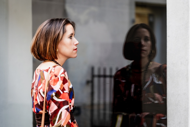
When it comes to editing, I like to preserve the natural colors of the scene as much as possible, without oversaturating or altering them. Of course, there are times when I may need to adjust the background colors to help highlight the subject. For example, in a nature scene, the color green can sometimes be too overpowering and take away from the subject. In those cases, I may desaturate the background to help the subject pop.
In addition to color adjustments, I also pay close attention to the texture and detail in the images. I use careful sharpening techniques to bring out the details in the subject, while avoiding any excessive or artificial-looking sharpening.
Authentic Skin Retouching
A very important aspect is skin retouching. Many of my clients in Switzerland say that they prefer to look authentic. This is an aspect to take into consideration when retouching the skin and even small wrinkles. I ask my clients what their needs are and how far I should go. Looking younger is nice, but most people do not wish to magically appear like they are 20 when they are not! I certainly don't!


Tailored Editing for Optimal Client Satisfaction
I will occasionally set a tone and give the images a certain look if I see that it might better represent your brand. We'll discuss this during the pre-production planning meeting before your shoot.
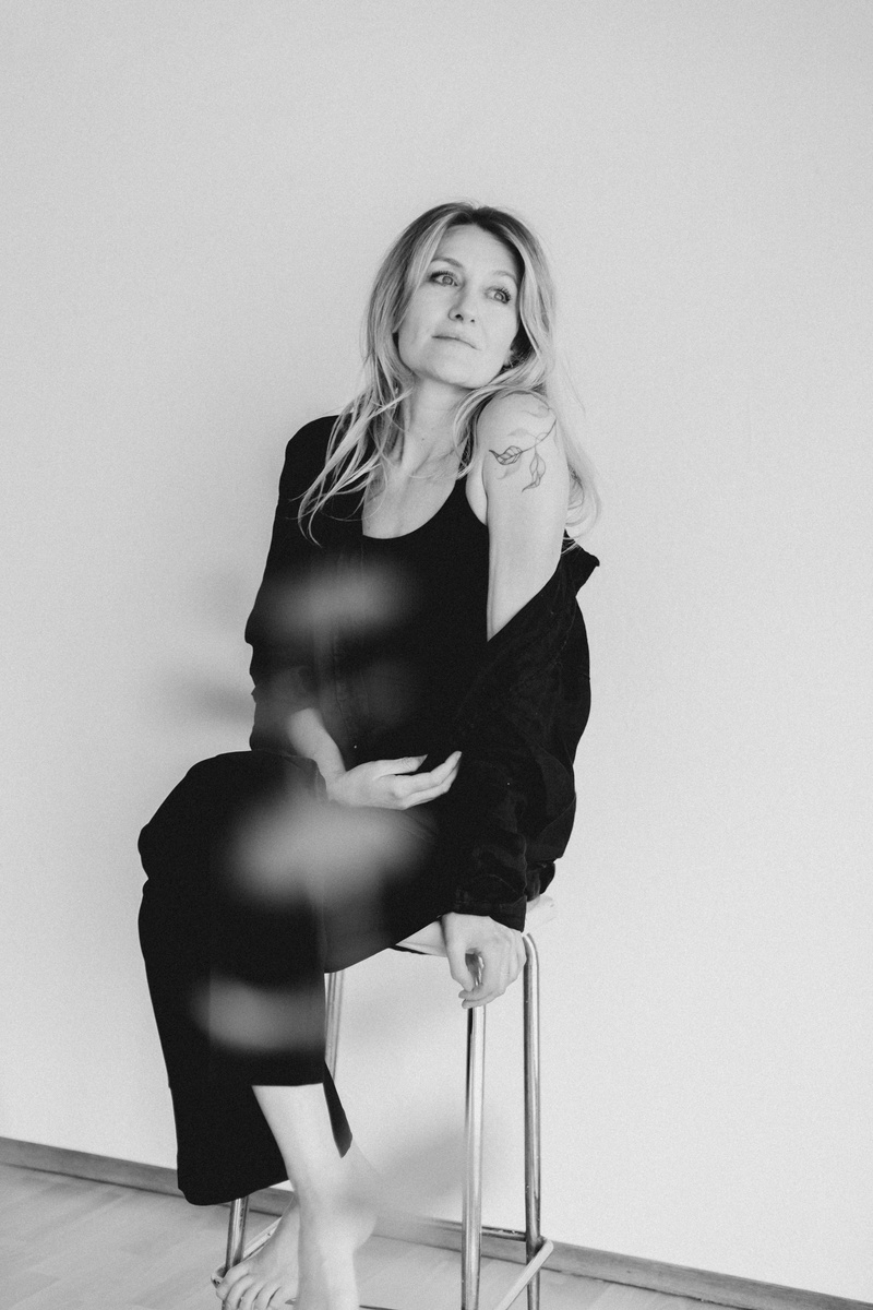
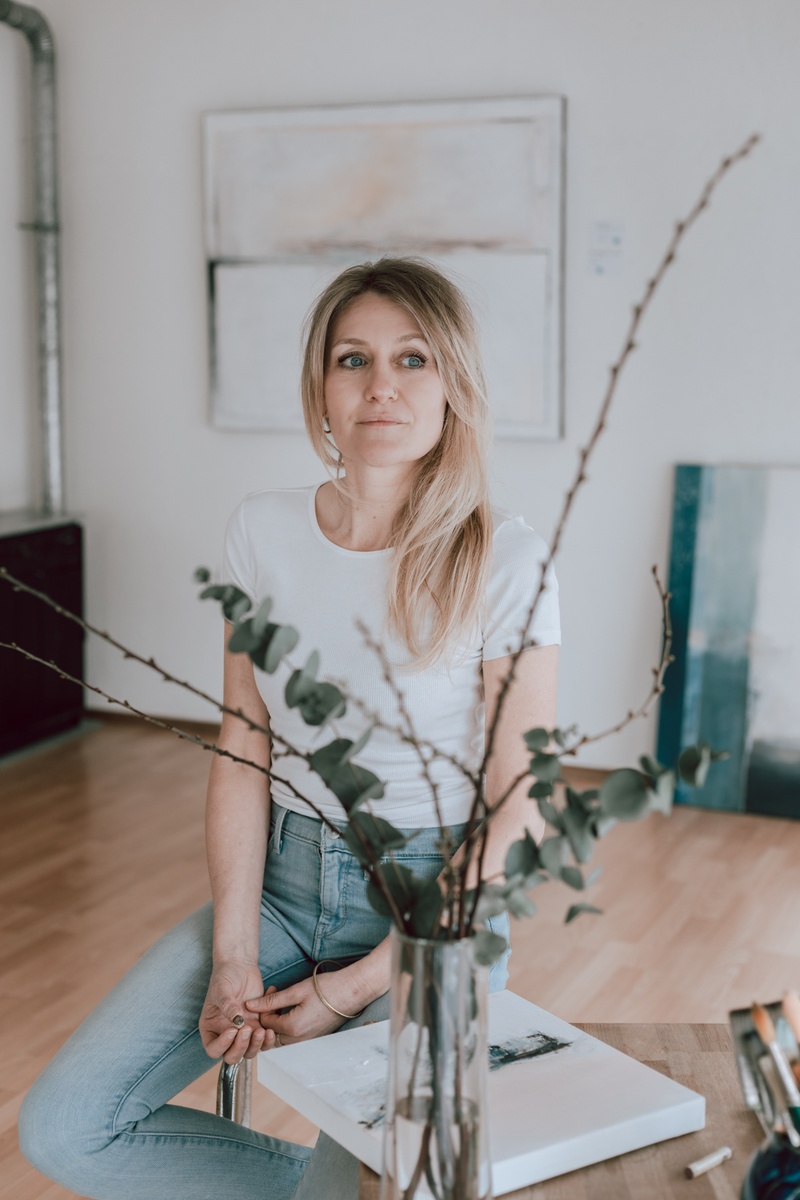
To describe her brand, painter Claudia Steinacher used the word "melancholy". I also noticed that many of her Instagram pictures were edited with muted tones. So I decided to use the same style to edit her images. Because of the same reason I also edited the pictures in black & white.
The satisfaction of my customers is very important to me. So I try to understand what is the best editing style for them and propose to modify the style according to their needs. I'm ready to make adjustments after the feedback to give them the best result.
Overall, I strive to capture the natural beauty of a brand by creating photographs that are both visually striking and authentic.
I hope this gives you a better idea of my approach to editing branding photos. If you have any questions or are looking for a photographer in Zurich, feel free to reach out.

